Graphing
Just as there are rules of grammar in composition, there are rules of graphing that help to visualize data for your audience. A well-designed graph should not need much explanation because the graph itself should make the trends in the data visually apparent. A well-designed graph also doesn't need any unnecessary decoration that doesn't convey useful information, such as depth on bars in a 2-D plot. Each of the following terms carries an important meaning.
Dependent and Independent Variables
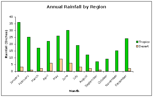
Imagine that we want to make a graph of the amount of rainfall that occurs at different times of year. Rainfall depends on time of year, but time of year does not depend on rainfall. Therefore, rainfall is the dependent variable and time of year is the independent variable. In some graphs, you may have more than one dependent variable, but never more than one independent variable. For example, you may overlap plots of rainfall in the desert and rainfall in the tropics against time of year, or you could graph inches of rainfall in 2005 and 2006 against time of year.
The Axes
The independent variable belongs on the x-axis (horizontal line) of the graph and the dependent variable belongs on the y-axis (vertical line). The x and y axes cross at a point referred to as the origin, where the coordinates are (0,0). In graphs with only positive values for x and y, the origin is in the lower left corner.
The Scale
Each axis needs a scale to show the range of the data on that axis. The low end of the scale may be zero or a round number value slightly smaller than the smallest data point. The high end of the scale is usually a round number value slightly larger than the largest data point. The scale is measured off in major and minor tick marks. Typically the scale runs from low to high in easily counted multiples like 10s, 50s, 100s, etc. When graphs are compared side-by-side, consider scaling them to the same data range to make comparisons easier.
The Axis Labels
Each axis needs a descriptive axis label indicating which variable is represented. For example, the y-axis label might read "Total Rainfall" and the x-axis label might read "Month"
The Units
If you are measuring time, you must include the units as well as the numeric values so people will know if you are talking about seconds, minutes, hours, days, years, etc. If you are measuring rainfall, people won't know if you mean inches, millimeters, gallons, etc. unless you include the units. Units should be reported following the axis label, as in "Total Rainfall (inches)."
The Data Points
Typically, each independent measurement represents a point on the graph. If there are multiple data sets being plotted on the same graph, each set should be represented by a unique symbol.
The Lines
Should you connect the data points with a line? Typically the answer is yes if the data points are part of a series of measurements of the same thing over a period of time, for example. The implication is that the values do not drop back to zero between measurements. However, if you are graphing a scatterplot, you might do a trendline or regression line through the points, but would not connect each one. In some cases, the relationship may not be linear, but exponential or logarithmic, or some other mathematical function, so a curve might be more appropriate than a line. However, there should be a reason why a particular curve is chosen.
The Legend
The legend becomes important when you are graphing more than one dependent variable. For example, your legend might indicate that green lines or bars represent rainfall in the tropics while brown lines or bars represent rainfall in the desert region.
Use of Color
Colors or patterns should be used to help convey information, but should not be used simply for decoration. In the previous example, why were green and brown chosen? If the colors were reversed, would this be better or worse? Why?
Which Visual Representation?
The type of data you are presenting may be better suited for one kind of graph than another. For example, if your measurements are periodic samples of an ongoing event, like rainfall each day, then a line with points helps to convey that message. If on the other hand, you are first averaging across distinct units of time like months, then bars might work better. If you are trying to visually display the pieces of a whole, a piechart might be a good choice.
Error Bars
Each point on the graph might represent a single data point, or the average of a collection of measurements at that point. In that case, it would be appropriate to express the range of variation around that point. Typically the error around the mean is expressed as the standard deviation, but with small sample sizes, the standard error is sometimes used.
The Title
The title should be a brief statement describing the subject of the graph, but should not describe or interpret the results.
What not to include
The graph should only include elements that enhance the interpretation, and there should be a minimum of visual adornment. For example, bars should not be 3-D unless the third dimension adds information.