The links below will take you to informational pages on a number of
popular computer applications used in qualitative research. In many
cases, there are links from these pages to demos that will allow you
to play with the product before committing to a specific tool.
Atlas
Nud*ist
- Probably the most widely used application.
Getting
Started with Nud*ist (Tutorial)
Code a Text (analysis
of dialogues)
The Ethnograph
(helps
you search and note segments of interest within your data, mark them
with code words and run analyses which can be retrieved for inclusion
in reports or further analysis)
Decision Explorer
However, for interpretive purposes, there's also a clear danger in
"automating the process too much." For instance, suppose an interview
subject used the phrase "organizational environment" in making a comment
related to "climate." It's the same idea, of course, but a manual, automated
search on "climate" would miss this quote. Of course, this is a rather
simplistic example - and certainly you can do searches on multiple strings,
keywords, etc. Still and all, in my opinion & also that of many of my
qualitative doctoral students, there's nothing quite like taking a deep
breath, jumping in and immersing yourself in your own data to really,
truly get a 'feel' for it. Time-consuming? messy? yes, no doubt. But
at the same time, the best way to really make sure you've mined out
all of the intended meaning from it.
- > Miles and Huberman ... a truly 'dynamic duo' that we'll hear more
about shortly ... have referred to this as the process of 'making
meaning!'
That, then, is your challenge! To distill down those volumes
of qualitative data and 'make meaning' in terms of answering your research
questions, identifying key response themes, ideas, variables, and constructs!
Now, on to our two basic "families" of such procedures!
Two Basic Strategies for
Qualitative Reporting &
Analysis
-- by the way, just a point of clarification before we dive in ...
I tend to use the terms "analysis" and "reporting" interchangeably
when it comes to the application of qualitative research procedures.
In the "bad ol' days" when there was so much initial resistance to qualitative
methods (not as long ago as you'd think!!!), I was a bit concerned that,
for dissertations & the like, some chairs/committee members might
prefer the term "analysis" for strictly quantitative, and
especially inferential (tests of hypotheses) procedures. To sort
of "pre-empt" such objections or concerns, I suggested to students that
they ask their chairs/committee members if "reporting" would therefore
be an acceptable substitute for qualitative procedures. The term "reporting"
would hopefully not imply "testing hypotheses/analytic statistics" and
comparable quantitative procedures. In those (relatively few) cases
where there was such an objection to "analysis," all of the chairs
and/or committee members comfortably accepted "reporting" instead. I
must say, it hasn't come up or been a concern lately. But just in case
you think it might be an issue for your own chair/committee, I'd handle
it as above and I'm confident it will be OK!
1. Summary narrative method. This is a very distilled (see?!
I told you that strategy would come in handy!) write-up of the key
findings as related to a given sub problem or research question.
It will undoubtedly take many, many (many, many!) rereadings
of your original source data to produce. But if you can get it down
to a concise, illustrative narrative -- manageable in volume but still
illuminative for your reader in terms of the "flavor" of responses to
that research question -- you've hit the mark!
This is the general framework I envision if you are planning to apply
this method:
Sub heading representing your sub problem or research question
- reproduced either in whole or in part.
Content of your summary narrative:
1. 2-3 paragraphs (or whatever it takes; this is just a very "average
ballpark") containing:
- Restatement in your own words of the key response themes
(in those interviews, journal entries, participant-observer logs,
open-ended responses, etc.) related to that question; and
- Judicious "sprinkling in" of key, colorful, revealing, illustrative
quotes that "vividly make the point" as related to those key themes.
Something like this might do it:
Sub problem X: Key features of organizational climate. The three
most frequently mentioned response themes, according to the 12 principals
interviewed, were [first theme], [second theme], [third theme]. (If
you like, even mention a tally of how many times each of these three
themes came up for discussion--please note: number of individual mentions,
not number of subjects who mentioned it--a key distinction!) As stated
by one principal "[content of his/her quote, of course with names or
other individual identifiers disguised/removed."
This is of course a general framework, but hopefully it gives you the
idea. We've discussed the judicious inclusion of that handful of
key quotes that are just *sooooo* vivid, well stated, memorable, etc.,
that you feel they simply *must* be included verbatim to illuminate
the sub problem for the reader! We've also discussed, in our EDR 720
Research Design, an unfortunate insecurity on the part of some budding
researchers to "accurately" restate original source data in their own
words. Trust me: you can do it! And you should, too, in
order to attain that "conciseness" and "parsimony" in your mounds of
qualitative source data! By following your instincts, you'll develop
a feel for which quotes refer to a concept but should just be tallied;
vs. which quotes also refer to a concept but really must be reproduced
verbatim.
2. The matrix or table shell method. Ah, what a glorious
invention in 1984! And the ultimate answer to those critics who said
that qualitative data are not as "neatly packagable" as quantitative
statistical findings and results!
For this one, we have Matthew B. Miles and A. Michael Huberman to thank!
They too struggled with having to roll up their sleeves, wade through
mounds of data - *and* produce a concise, yet complete, "answer" to
a sub problem or research question that wouldn't overwhelm a reader!
Basically, a matrix or table shell is a vivid visual!
You'd still write some summary narrative around it. But your goal with
the matrix or table shell is to produce a vivid, readable, easily understood,
concise visual that 'tells the story' at a glance!
Or, as Miles and Huberman put it:

That's right!!! A picture is, indeed, worth a thousand words!!! And
a lot more quickly understandable than those thousand words!!!
The following is a general framework for a matrix as suggested by Michael
Quinn Patton. The rows and columns may emerge from your individual sub
problems. For instance, if you are looking for categories of response
difference, by, say, gender, then you might envision two rows for men
and women. The columns could be the categories of those response themes
- either sorted by your sub problems, or as they "emerge" from your
immersion in those responses. The latter, far from being "too subjective,"
actually represents classic "grounded
theory!" Those categories become evident to you as you read and
reread your responses.
Here is Patton's schematic for a matrix, or "table shell," for an evaluation
of an educational program.
He chose to make the rows "processes". These would be,
in his terminology, "-ing" or action words: for instance, "planning
the program," "training the teacher-participants," "teaching the actual
lessons," "grading the assignments," etc.
His columns, on the other hand, represent "outcomes."
Some of these could be decided upon prior to the evaluation. They could
include learning objectives for the students in the program such as
minimum scores on standardized achievement tests. They could also include
attitudinal and behavioral outcomes for these students to go along with
the content-area achievement tests. These could be measured by teacher-made
tests, observations, interviews with the students, compilation and analysis
of students' comments as reflected in their journaling, etc.
As with all qualitative research, too, we can and often do find unanticipated
outcomes - and processes, for that matter. These would again represent
ex ante, emergent, classic "grounded theory" factors.
Trust your judgment on these! (We'll talk about ways
to get a 'reality check' on these when we discuss validity and reliability
issues later on in this course.) And add them to the rows or columns,
respectively, as they seem to "jump out at you" from your immersion
in those qualitative data.
Here's Patton's schematic for a matrix, or table shell, cross-classifying
his qualitative data by program process (rows) and program outcomes
(columns) :
| Processes (rows) by Outcomes (columns) |
Outcome a |
Outcome b |
Outcome c |
Outcome d |
Outcome z |
| Process 1 |
Linkages expressed as themes, patterns, quotes, program content
or activity |
Linkages expressed as themes, patterns, quotes, program content
or activity |
Linkages expressed as themes, patterns, quotes, program content
or activity |
Linkages expressed as themes, patterns, quotes, program content
or activity |
Linkages expressed as themes, patterns, quotes, program content
or activity |
| Process 2 |
Linkages expressed as themes, patterns, quotes, program content
or activity |
Linkages expressed as themes, patterns, quotes, program content
or activity |
Linkages expressed as themes, patterns, quotes, program content
or activity |
Linkages expressed as themes, patterns, quotes, program content
or activity |
Linkages expressed as themes, patterns, quotes, program content
or activity |
| Process n |
Linkages expressed as themes, patterns, quotes, program content
or activity |
Linkages expressed as themes, patterns, quotes, program content
or activity |
Linkages expressed as themes, patterns, quotes, program content
or activity |
Linkages expressed as themes, patterns, quotes, program content
or activity |
Linkages expressed as themes, patterns, quotes, program content
or activity |
From Michael Quinn Patton, How
to Use Qualitative Methods in Evaluation. 1987: Sage Publications,
Program Evaluator's Kit, 2nd ed.
The dimensions, of course, could be any factors you'd like them to
be: again, both preplanned (ex ante) or emergent from immersion in your
data (ex post, "grounded theory"). It is also possible to make a matrix,
or "table shell," of single dimensionality (just rows or columns), or
three-dimensional as well. It all depends on the needs and circumstances
of your particular study.
I'd like to illustrate for you a *most relevant* matrix of our own
at this time! It's the matrix displaying the evaluation results of our
pilot test of teaching courses by modem!
AOL Matrix
Data for this evaluation matrix consisted of the letters and E-mail
messages containing evaluative comments regarding our Summer Sessions
I and II, 1994, courses taught by modem.
The columns of this matrix are a very popular choice of dimension if
you are evaluating a program, process or procedure:
- perceived strengths;
- perceived insufficiencies (which we find less 'emotionally
loaded' and threatening to the users than a term like 'weakness,'
but that is just our particular preference);
- recommendations for improvement.
The rows could very well have consisted of the courses themselves.
These were: Intro to Statistics; Intro to Research; Research Design;
and Intermediate Statistics. However, immersion in these data suggested
alternatively categorizing the evaluation comments along the lines of
the following aspects of the instruction - they became the rows:
- the technology itself (AOL);
- the course materials;
- the instructor (that's me!).
Please note the contents of the cells and how they reflect Michael
Quinn Patton's suggested schematic, pg. 14. The key response themes
are summarized in descriptive phrases to reflect the "gist" of the original
source quotes.
Furthermore, you will see numbers in parentheses following the comments.
These are sorted in descending order (not required, but somewhat traditional)
and reflect the number of times that a given comment was made.
Again, these were by individual comment, rather than subject. They were
expressed in different words, of course, but essentially classified
as "relating" to that given overall concept which is summarized, starred
and concisely restated in this matrix. (Also customary: no number after
a summary idea means it was mentioned just once.) Tallying and presenting
this frequency of mention of key response themes is one of the simplest,
most basic, ways to "go multimethod" and combine quantitative
and qualitative data in your analysis.
It is certainly possible to come up with "empty cells."
These would be analogous to "missing values," or non-response,
in a quantitatively oriented and coded survey, for instance.
However, keeping in mind the "art" and "judgment" involved in "making
a matrix," if you start getting too many empty cells, it may
be a clue that you've "crossed the wrong factors" as rows
or columns. For example, if we had had too many empty cells along
the lines of the preceding "aspects of instruction - rows", it might
have been a clue that we should maybe try reclassifying the comments
by courses taught as rows. That scheme, or some other(s), could very
well result in a "cleaner classification," "better fit," etc.
I do want to remind you at this point that application of the matrix
or table shell method doesn't necessarily mean a 'table' per se. Those
terms are meant to be catch-alls for the more general Miles and Huberman
admonition of "Think display!" that we saw on pg. 12.
Any creative visual display -- limited only by your imagination! --
would qualify!
The preceding course evaluation matrix was presented and discussed
under the "Findings and Results" section of the evaluation report. Brief
summary narrative was also presented, with subheadings corresponding
to each row of the matrix. As indicated in the guidelines discussed
above, this accompanying brief narrative consisted of a restatement
of key response themes, along with presentation of illustrative quotes
(from your letters and E-mail messages).
However, any "good" evaluation report ought to proceed from the findings
to some conclusions and recommendations for the future. (Sounds a lot
like our dissertation Chapter Five, doesn't it?!) In proceeding to these
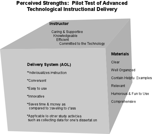
conclusions and recommendations, the following figures seemed like a
vivid visual way to "grab" the readers of the report and "hit them between
the eyes" with these key findings and conclusions.
You'll notice that the dimensionality of the cube corresponds to the
three rows of the matrix: namely, the aspects of the program (technology
itself; course materials; and instructor attributes) being evaluated.
Likewise, for the shape containing the recommendations, it seemed logical
to show the two sessions (Summer Session I and II)
as "feeding into" this centrally placed figure of recommendations.

This is yet another example of a qualitative matrix, or table shell.
It comes from a paper I wrote with Elizabeth (Beth) A. Packard, Program
Coordinator for Special Grants of NAU's Arizona Center for Vocational
and Technical Educational department. For two years I collaborate with
Beth on evaluating the outcomes of the Summer
Youth Employment and Training Program (SYETP). During the second
year she particularly wanted to see if the emergent comments of the
youth-participants varied by setting. You may recall from our previous
modules that this would be equivalent to a "cross-case analysis," as
per Robert Yin, if we define a setting as our "case." Two interview
sessions were conducted: each with 8-12 youth from each of the two sites.
The site, therefore, became a natural "dimension" (in this case, columns,
although it could just as easily have been the rows) for the resulting
matrix.
Such summary visual displays of key qualitative findings, conclusions,
recommendations, etc., are limited only by your imagination!
Please remember to think in terms of the key criteria:
- concise;
- readable;
- vivid, memorable visual
In other words: does it effectively reduce the mounds of original source
data and effectively "bottom-line" it for a busy reader that report
who needs this information packaged ready to use?
Think of the image of an overworked administrator or manager who delegates
the fact-finding duties to you and says: "Now, bottom-line it for me!
Tell me simply, directly and clearly: what does all this say and what
do I do about it?!"

The possibilities for creativity are virtually endless!
Former Professor Emeritus Dick Packard has a terrific "emergent qualitative
paradigm" of the key pieces of an educational organization (school;
district) that impact upon the desired "target" outcomes of student
academic achievement. He depicted the overall shape as a rocket!
(This was right after the Challenger tragedy, and Dick's way of honoring
the late Christa McAuliffe.) The tip, or nose, of the rocket was that
ultimate desired "student academic achievement" outcome. But, supporting
it and underneath, were those other factors that, if not attended to
properly, could effectively 'get in the way' of reaching that desired
"student academic achievement" outcome. Dick divided these into two
subgroups:
- Support factors: base of rocket (e.g., district funding;
state legislation impacting the school or district);
- Focus factors: stem of rocket and directly underneath the
desired target "student academic achievement" (nose of rocket) --
such things more in the realm of direct control, such as the evaluation
system used for students, faculty and staff within the school or district).
This model became the focal point of a series of evaluation reports
that Dick and I co-authored regarding the 5-year pilot test of the Arizona
Career Ladder Teacher Incentive & Development Program. We conducted
qualitative interviews on-site with key informants of those participating
districts (e.g., students, faculty, staff, administrators, school board
members, parents, general public at large) and classified the data according
to the elements of the model.
These can be found via an ERIC search under "Packard and Dereshiwsky"
if you're interested! Last but certainly not least! If you're still
feeling like you would like a 'creative nudge,' and more examples on
how to do up qualitative matrices, table shells, and other visual displays,
there's an excellent resource that's jam-packed with examples! It's
Qualitative Data Analysis: An Expanded Sourcebook by none other
than our matrix pioneers, Matthew B. Miles and A. Michael Huberman!
The 2nd edition came out in 1994, by Sage Publications, Inc., Newbury
Park (Los Angeles), California.
Dick Packard and I have also established a special reserve in Cline
Library at NAU containing top-quality research resources for our doctoral
candidates. We have contributed many of our own books to this excellent
collection. I kicked in several copies of the "old" but still "very
good" 1984, 1st edition, of this classic how-to Miles and Huberman matrix
book. Diana, you're the lucky one to have easiest access to it! You
may find it under: EDR 798, Dissertation Seminar, Packard. (I'm hoping
the rest of you can scrounge it up at your local university libraries.)
I would recommend that you first thumb through it and skim the graphics
and other displays, rather than try and read it cover to cover. The
idea is to get an idea of "how to make matrices" and other displays.
Invariably, after paging through it in this manner, students report
that they get related ideas for how to do up their own dissertation
and other research displays! Miles and Huberman also have a lot of quality
advice regarding issues such as validity and reliability in qualitative
research. We'll be returning to these later on in our course.
- - -Quick "my-story" time again! One of Dick Packard's and my proudest
possessions is a letter written to us from A. Michael Huberman himself!
He and Matthew Miles were interested in seeing how various qualitative
researchers around the country had adapted the matrix/display idea.
Ah, to rub elbows with the leading lights of research ...!
Next time, we'll swing back in the research design procedures and take
the aerial view of sampling!