Case Study: Cline Library Learning Studio
Fall, 2013: Several layouts have been proposed for the design of a large technology classroom at NAU's Cline Library. The designs being considered are based on the SCALE-UP model popularized about 10 years ago by MIT's innovative TEAL lab concept. I was asked to provide input after seeing the initial plans for the room. Classrooms that use the SCALE-UP model are designed around the need for a particular mode of instruction; small group collaborative work focused on the computer, generally because of the need for expensive and processor-hungry custom software such as CAD or Adobe Creative Suite. A typical teaching session unfolds in the following way: The instructor conducts a brief computer-based presentation that outlines the task to be accomplished, and then the students work together in small groups on the project, sharing one computer and screen per group, while the instructor moves about the room offering guidance. However, with furniture bolted to the floor, and with students oriented towards screens rather than the instructor, this room design offers few pedagogical alternatives. With a single hard-wired computer per group, students will have difficulty working independently or sharing content from their personally owned devices. In short, the problem with SCALE-UP rooms is that you can only do student-centered group work with technology. The fixed classroom layout, with hard wired power and data connections, precludes other uses. And, in large SCALE-UP rooms, it becomes difficult to manage so many students. This design may prove challenging for some of our instructors who are, for the most part, uncomfortable with technology and experienced primarly in lecture-style instruction. SCALE-UP rooms were popular a decade ago because of technology limitations of the day. Mobile computers were both expensive and underpowered. A powerful desktop machine with a lot of RAM and a high-end graphics card, tied to a large flatscreen display, was a luxury that people didn't mind sharing. Clearly, a lot has changed since then.
When assembling focus groups of faculty to provide input on a classroom design, it's important to listen to the general needs and to ignore the impractical and idiosyncratic ones. Otherwise, you end up with a room that checks every box on a punchlist but, like the car Homer Simpson designed, it's costly and not particularly good for general use. Here are the central questions I would ask about the design of a modern technology classroom: What is the instructional/learning objective of these designs? Which instructors are asking for a room configured this way? How do they intend to use it? If someone is assigned to teach in this room based solely on its capacity, would they be willing or able to take advantage of the room's unique features? It would be a shame if it was used only for lecture with PowerPoint, for example. A design based on the SCALE-UP model will be attractive, but inflexible and expensive. How well will it serve the needs of the faculty and students scheduled to teach and learn there?
The most popular technologies of today, wireless mobile devices like smartphones and iPads, and cloud-based services like Google Apps for Education, did not even exist when the SCALE-UP model was conceived. Technology is typically the first thing to go obsolete in a classroom, so it should be flexible, easy to replace, and the last thing to decide on. Because of Moore's Law, simply delaying a hardware purchase until there is a product refresh can double the performance or halve the price of the equipment. Hard wired computer labs are still useful for teaching expensive specialized software application packages like CAD or Photoshop, or to level the playing field during computer testing but, for web browsing or work in an office suite, most students are happier with their own devices. Why not embrace that?
The emerging trend in campus technology, number one on the priority list of IT Pros in a 2013 Educause survey, is the bring your own device (BYOD) movement. Students are bringing inexpensive laptops (netbooks, Chromebooks, etc), iPads, Surfaces, and smartphones to class in ever-increasing numbers. In the BYOD model, the room provides the utilities, not the equipment. There are projection screens, possibly a fast network printer, a wi-fi access point with good throughput, and power outlets around the periphery. With built-in wi-fi and long lasting batteries, mobile devices need neither ethernet nor power. In a BYOD design, we need to spend more time thinking about how devices will connect to the room's services. Do we have the right adapters? Do we have an intuitive video switching system? Can we do wireless projection? Once we solve those problems, it's actually cheaper, requires less maintenance, and reduces the need for equipment security because students take better care of their own devices.
Active learning works best when the room can be quickly reconfigured for different activities.
With flexible furniture, like the Steelcase VERB system shown in this video, and a BYOD model, your room can look like any of the examples below (click on the images to show larger versions), or can take on any other arrangement that makes sense:
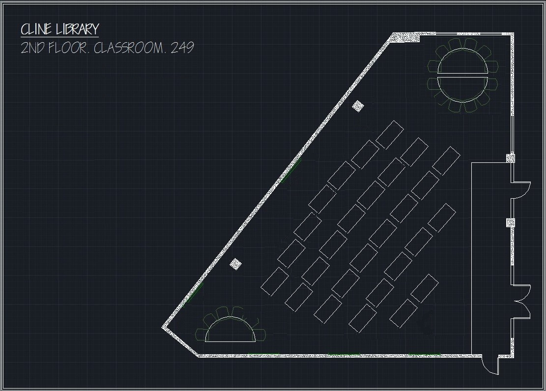
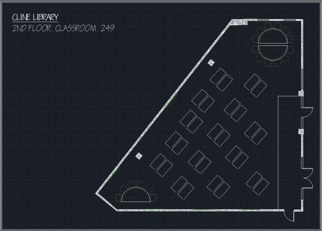

Since building a sub-floor for ethernet cabling and power could be avoided, a significant portion of the budget could be re-deployed. There are a number of things that could give the room some additional character and useful features. In these flexible designs, the total room capacity could be the same, but there might be some good reasons to reduce the capacity a bit. With 28 tables, there's seating for 56 students, but more room around both sides of the classroom, bounded by those immovable support pillars. While it's certainly feasable to add 8 more student desks and raise the capacity to 72 students, it might make the room more versatile to "carve out" those oddly shaped off-to-the-side spaces for other uses. An informal meeting space with coffee tables and a set of upholstered chairs could sit in the corner by the window. It could even be glassed in for sound-proofing without adversely affecting the only source of natural light to the room. Perhaps the tight corner on the opposite side could have some diner-style booths with power outlets, lockable storage for charging laptops or tablets, storage for student projects or art supplies, or a designated "group table" for breakout activities? These distinct spaces would allow instructors to rotate small groups of students off to a side project, or leave room for demonstrations, teaching aids, etc. If group work is a priority for this room, students will need space to spread out and increased one-on-one time with the instructor. Even a class of 30 can be difficult to manage well when hands-on activities and group projects are a key component. The semi-private breakout spaces on the sides are good places for "small" 60 inch televisions, but a bright LCD projector pointed at a front wall whiteboard between the pillars, and a second projector pointed at a left side wall whiteboard could serve as focal points visible to the entire room. Both whiteboards could use non-reflective paint for direct projection, allowing the instructor to write on what is projected. Ceiling recessed, powered, drop-down projection screens could be added if desired. A lectern just to the right of the right side pillar would offer the instructor a commanding view of the whole room and both projection screens, out of the direct path of the beam. Students with iPads or smartphones should be able to project to the screens wirelessly using a Crestron controller, Kramer VIA, ChromeCast, AppleTV or Roku device.
In a room designed like this, the instructor has more choices. Group work is possible, but it's not the only option. Technology can be used or put aside. Ongoing projects can be stowed in storage cabinets. Small groups can break away to do planning. Small screens are available for sharing work. Big screens and whiteboards are on all available open walls. Furniture can be easily rearranged for the activity of the day, whether it's group work, lecture, or student presentations. This is a classroom with more possibilities.
Well, those were my recommendations. It will be interesting to see how the room design comes out, and I'll post pictures when it's done. I will also follow up with a review of how the new room gets used by faculty and students.
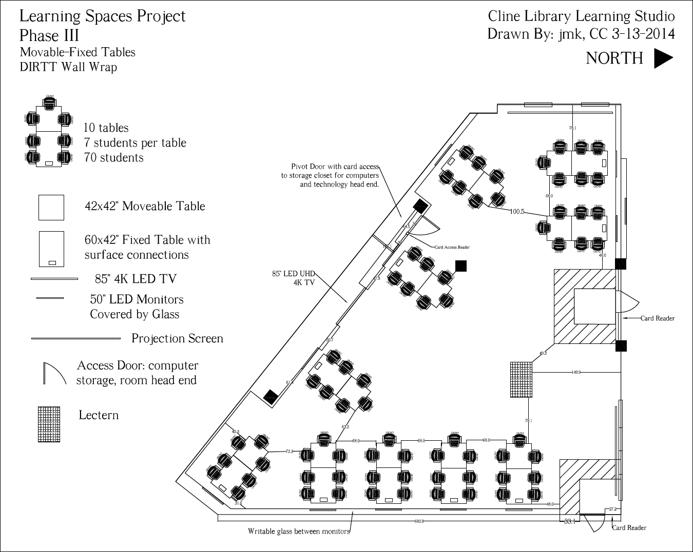
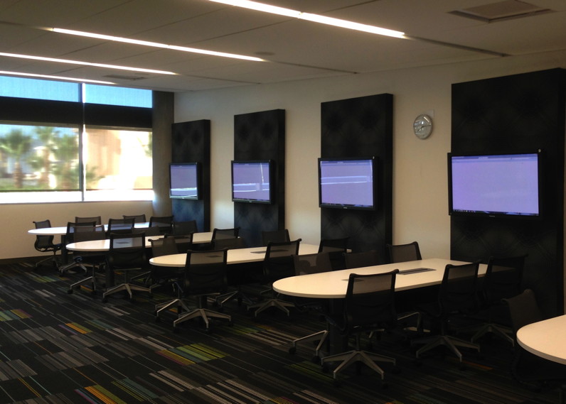
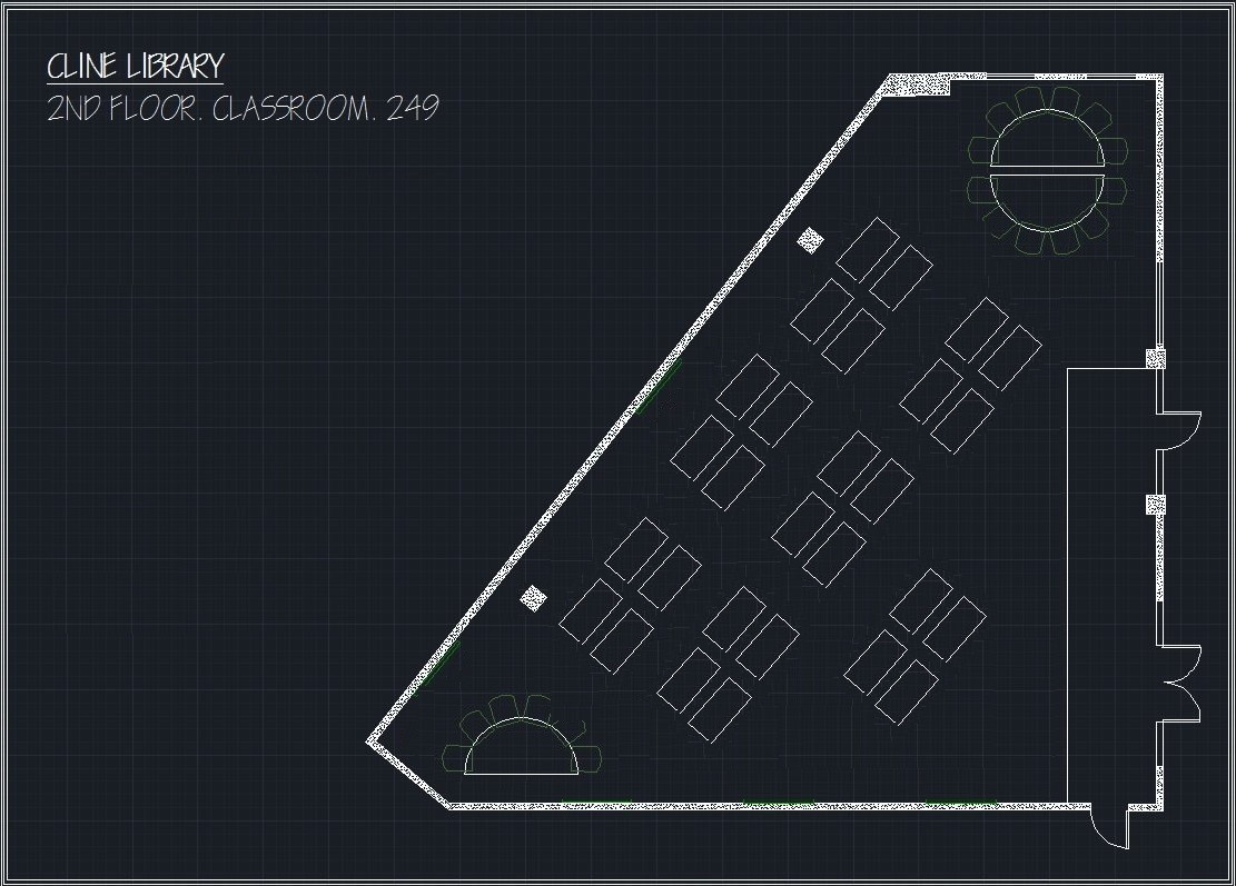
Fall, 2014 Outcome: The library decided to go with a subfloor networking and power approach, with SCALE-UP style fixed furniture, and with a sophisticated A/V switching system. A layout of the room is shown below. The final cost of the 70-seat room was about $1 million. A report on the effectiveness of the room has been prepared by NAU Assessment Office staff.
Selected Findings of the Report:
- The room is being used primarily for teacher-centered presentations (PowerPoint).
- The A/V switching technology is problematic and difficult for faculty and students to operate.
- Effectiveness of the room could be enhanced by aligning teaching and learning pedagogies to the opportunities afforded by the space.
Conclusions: It's an attractive room with a lot of potential but, in my opinion, it's an outmoded design and a bit of a white elephant. With $1 million, approximately 10 high-end classrooms could have been modernized to do what this room is primarily being used for; teacher-centered Powerpoint presentations. There is an inevitable trade-off between complexity and ease-of-use. The A/V system is difficult to use because it was designed to do anything imaginable rather than tailored to do a few things well. The high cost came from trying to retrofit the room with sub-floor power and data yet, with the exception of the lectern, all of the powered, fixed furniture is up against the walls, so this was an outrageously expensive solution. To get the most out of a unique room like this, it should be used for computer assisted design, hands-on physics and engineering experiments (dry labs), instruction on the use of Photoshop and Illustrator, etc. Put to such specialized uses, it could pay off. This room is not, however, a good model for other technology classrooms around campus because of the great expense and inflexible design decisions.
