


|
|
|
|
|
|
§ Excel and Equations §
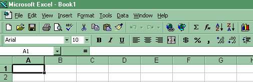
Excel- commands used in this topic (Excel in Office 97 and Office 2000)
§ Frequency Distributions § Histograms § Frequency Polygons §
§ Ogives § Pie Charts § Nominal Data § Equations §
Excel Steps
Frequency Distributions
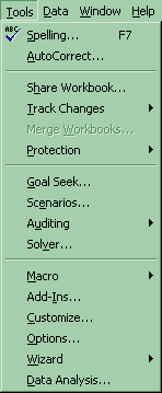
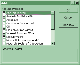
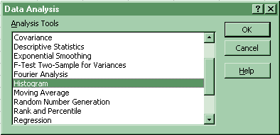
(1) Use the steps to get a histogram. The frequency distribution will be a part of that output. Click on Tools-Data Analysis-Histograms. If you do not want the histogram to show up, do not click Chart Output. If Data Analysis does not show up, then click on Tools-Addins and select the top two options of Analysis Pack and Analysis Pack VBA.
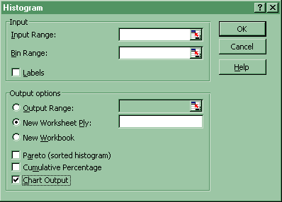
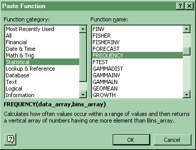
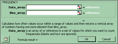
(2) Create Bin value equal to the upper class limit (UCL) of each class. Highlight the cells next to the Bin values plus one cell. Click Paste-Function-Statistical-Frequency. Fill in the arrays in the box. While the box is still opend press Control-Shift-Enter. See (1) above for how to get a frequency distribution as part of a histogram output.
![]()
Histograms
Click on Tools-Data Analysis-Histograms. Select Chart output. If Data Analysis does not show up, then click on Tools-Addins and select the top two options of Analysis Pack and Analysis Pack VBA. (See Frequency Distributions (1) above). Histograms should not have gaps between the bars. After you have created the histogram and resized it to the size you want, right button click on one of the histogram bars- select Format Data Series- click on the Options tab- and set Gap Width to 0..
About the Histogram dialog box
Input Range
Enter the reference for the range of data you want to analyze.Bin Range (optional)
Enter the cell reference to a range that contains an optional set of boundary values that define bin ranges. These values should be in ascending order. Microsoft Excel counts the number of data points between the current bin number and the adjoining higher bin, if any. A number is counted in a particular bin if it is equal to or less than the bin number down to the last bin. All values below the first bin value are counted together, as are the values above the last bin value.If you omit the bin range, Microsoft Excel creates a set of evenly distributed bins between the data's minimum and maximum values.
Labels
Select if the first row or column of your input range contains labels. Clear this check box if your input range has no labels; Microsoft Excel generates appropriate data labels for the output table.Output Range
Enter the reference for the upper-left cell of the output table. Microsoft Excel automatically determines the size of the output area and displays a message if the output table will replace existing data.New Worksheet Ply
Click to insert a new worksheet in the current workbook and paste the results starting at cell A1 of the new worksheet. To name the new worksheet, type a name in the box.New Workbook
Click to create a new workbook and paste the results on a new worksheet in the new workbook.Pareto (sorted histogram)
Select to present data in the output table in descending order of frequency. If this check box is cleared, Microsoft Excel presents the data in ascending order and omits the three rightmost columns that contain the sorted data.Cumulative Percentage
Select to generate an output table column for cumulative percentages and to include a cumulative percentage line in the histogram chart. Clear to omit the cumulative percentages.Chart Output
Select to generate an embedded histogram chart with the output table.
Frequency Polygons
Click on the Chart Wizard button-XY Scatter- Scatter connected dots.
![]()
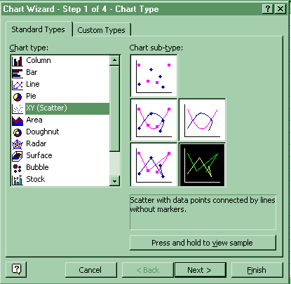
An xy (scatter) chart either shows the relationships among the numeric values in several data series or plots two groups of numbers as one series of xy coordinates.
Ogives
Click on Tools-Data Analysis-Histograms. Select Cumulative Percentage and Chart output. If Data Analysis does not show up, then click on Tools-Addins and select the top two options of Analysis Pack and Analysis Pack VBA. Select Cumulative Percentage and Chart. (See Frequency Distributions above)
Pie Charts
Click on the Chart Wizard button-Pie.
![]()
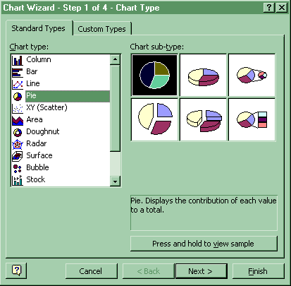
A pie chart shows the proportional size of items that make up a data series to the sum of the items. It always shows only one data series and is useful when you want to emphasize a significant element.
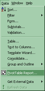
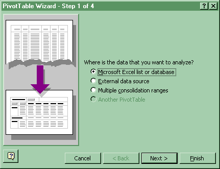
Nominal Data, Frequency Distribution, Bar Chart and Pie Chart
Frequency Distribution: Put nominal data into a single column. Click Data-Pivot Table Report. Select Microsoft Excel list. Select all of the nominal data including the title. Drag "Data" (assuming you have used Data as the title of the nominal data) to inside the "row" area and to inside the "data" area.
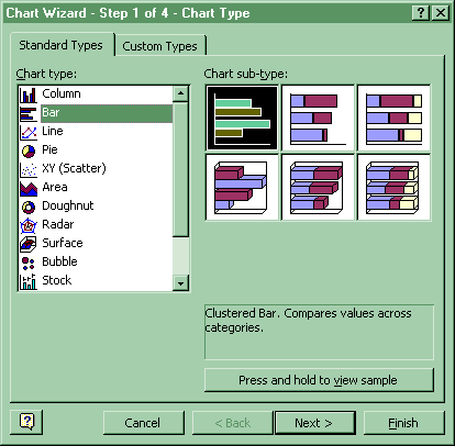
Bar Chart: Click the Chart Wizard-Bar. Include the nominal data and the numerical data from the frequency distribution for series
![]()
Pie Chart: Click the Chart Wizard-Pie. Include the nominal data and the numerical data from the frequency distribution for series. (See Pie Chart above)
Descriptive Graphs
§ Equations §
§ Class width § Relative frequency §
§ Cumulative relative frequency §
§ Class midpoint §
1. Class width
CW = (H - L) / k
High = H
Low = L
k = #classes
2. Relative frequency
rf = f / n
f = frequency
n is the number of data values
3. Cumulative relative frequency
crf = Srf
4. Class midpoint
CM = (LCL + UCL) / 2
LCL = Lower Class Limit
UCL = Upper Class Limit
Go on to Home
Work
or
Go back to Descriptive
Graphs: Activities and Assignments
Please reference "BA501 (your last name) Assignment name and number" in the subject line of either below.
E-mail Dr. James V. Pinto at
BA501@mail.cba.nau.edu
or call (928) 523-7356. Use WebMail for attachments.

Copyright 2002 Northern Arizona University
ALL RIGHTS RESERVED